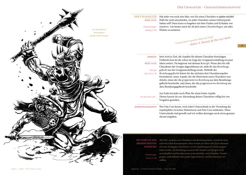
I like to work with concepts. Happy with dogmas. Also Malmsturm is subject to some dogmas. Both the way the language is spoken and the sources of inspiration and how we use them. Not everything that is cool finds its way into the book: it also has to satisfy the paradigms underlying the project. This is often uncomfortable, but it really helps to create a stringent product.
The first version of Malmsturm was very special. This is certified by some reviews, votes at booths as well as praise and facial hair strokes in forums and e-mails.
It goes without saying that we and the game are undergoing development. Björns announcement, for the second version simply put on an optical shovel and if it could just be a bit nastier, the team acknowledged with a simple “very happy!” This is of course more than enough incentive for me to follow suit with the layout , While the first layout was a reminder of the good old book and a retrospective on the four-color mania we’ve been acclaimed in role-playing in recent years, it was also meant to be more readable and give the illustrations the space they need ,
Malmsturm was and is a fantasy role-playing game, without drowning the look in parchment, medieval and grunge elements. The illustrations speak a clear language and carry the atmosphere, while the layout never wanted to be too intrusive and fantasy esk. With the new version, I go one step further: more modern, readable, structured and graphical without denying the anchor that Fantasy uses.

If you see the layout for the first time, you may be disturbed by the optical dissonance that has arisen. But just maybe. It is not very pleasing and yet fitting. Why is that?
First, the old layout was turned to the left and color comes into play. The fact that Malmsturm is now colored, but has the sole purpose and to make the layout better and more legible: Design follows function . With colors you can create a lot of structure as well as placement. That’s what I wanted. In the midst of musical inspiration, we get far out in color and dress in gold, white, red and black. The base of the colors is based on my cowl, which consists mainly of band patches of these colors. Anyone who takes the trouble and makes color schemes based on various album covers, will not be particularly surprised to find exactly these colors. That’s why suddenly color!
In general, readability is always a big issue at Malmsturm. In addition, I say goodbye to the block sentence and a left-fluttering set will be introduced. Although the block just might appear more harmonious in the overall picture, the fluttering sentence is more appealing to the eye, since the distances between the individual words remain the same. But it remains usually one column, simply because I defend myself, the two-column RPGeinerlei set ^ ^. Call it protest anarchy or simply “I like it better.”
The good old B5 format is also in use. Although I realized with scare that the old books have a payer in the format and are smaller than B5. This, in turn, is doing quite well now as the two books settle on the shelf of the new series. And yes: gold cutting remains!
When it comes to layout, I’m fiddling with an old idea that already sprouted up to the first set of rules, but could not quite be resolved. The idea shows how metal influences the Malmsturm project creatively. In graphic design, the Golden Section is used, a theory of harmony that can be mathematically understood and applied to create space. In music, especially in Metal, there is something similar (the chromatic or the tritone). The latter has been described by the medieval monks as a diabolus in musica (devil in music) because of its menacing sound. Some metal bands pick up the tritone in their works. So what if you try to visualize a harmonic or dissonant music teacher? I was now looking to mathematically convert this scale to a layout. Since music is the little brother of mathematics, that should work. I found the frequency ratio of the tritone. Based on the tritons, I want to cobble together the diabolus in paginis …

Leave a Reply